Marvel Rivals' Clone Hero Crisis: When Blue-and-White Blurs the Battlefield
The hero shooter landscape has always thrived on instant readability, a design principle as fundamental as a traffic light’s clear signals. Yet in the bustling arenas of Marvel Rivals, a quiet crisis has brewed since the game’s second season, turning this pillar into a pile of rubble. NetEase’s vibrant comic-book brawler, which launched in late 2024 to critical acclaim for its breathtaking character work, now finds itself wrestling with a growing silhouette problem that leaves players squinting at their screens like astronomers trying to distinguish three nearly identical stars in a single telescope frame.
Since strategy trumped raw aim in this third-person spectacle, recognizing a hero at a glance has been a matter of virtual life and death. Unfortunately, the arrival of Emma Frost on April 11, 2025—celebrated as a much-needed Vanguard addition—also poured gasoline on a smoldering design fire. Standing next to Sue Storm and Dagger, Frost forms an unintentional triptych of platinum hair, skin-tight bodysuits, and a predominantly blue-and-white palette. The similarity has become so pronounced that players have started calling them the “Cerulean Sisters,” an ironic nickname for three characters who appear to have raided the same interdimensional closet.
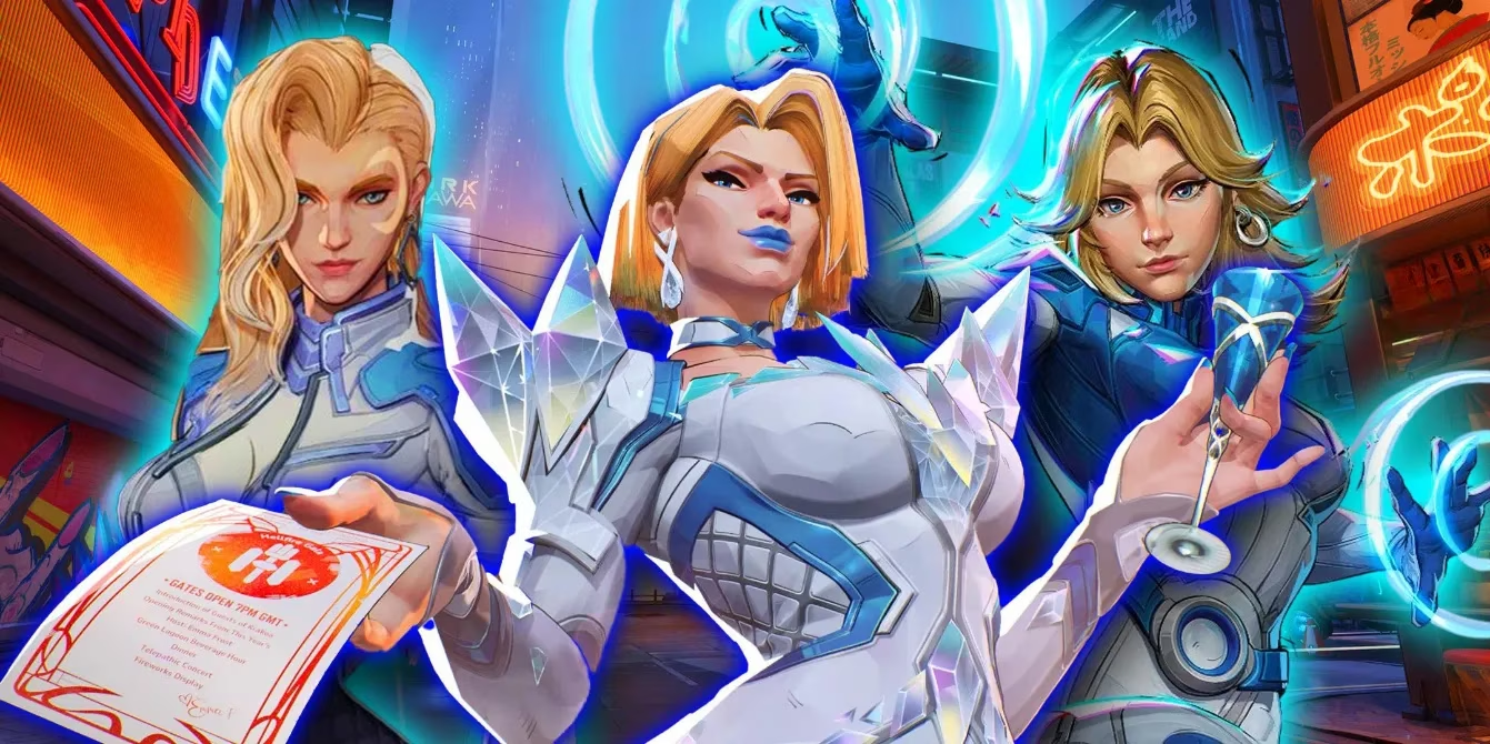
This is not a trivial nitpick from armchair art directors. Competitive multiplayer games depend on what developers call “readability”—the split-second ability to parse an enemy’s identity from their outline, movement, and color scheme. A tank should never masquerade as a support, just as a wolf should never wear a sheep’s fleece. When Sue Storm’s sleek, pale-blue uniform and flowing blonde locks can be mistaken for Dagger’s similarly ethereal design, the battlefield becomes a guessing game. Add Emma Frost, whose Vanguard role brings a devastating melee presence, and the consequence of misidentification shifts from embarrassment to elimination. A player who mistakes the diamond-skinned bruiser for a fragile Strategist may rush in for a quick kill, only to be shattered themselves—like a moth confusing a porch light for the moon.
The issue has sparked a wave of community frustration, particularly in the game’s competitive mode, which remains a popular test of skill despite NetEase’s admirable focus on casual fun. Reddit threads have overflowed with clips of confused players hesitating for that fatal half-second. One user, Informal-Cod4035, discovered that even the developers are in on the joke, adding an in-game character interaction that wryly references the doppelgänger dilemma. While a wink and a nod can soften the blow, the underlying problem persists: mistaking a Vanguard for a Strategist isn’t just a fashion faux pas; it’s a match-losing mistake.
A deeper look reveals that Marvel Rivals inherited this curse from its source material. Marvel Comics has long drawn its heroines with a homogenized aesthetic—willowy, fair-haired, and often clad in variations of blue or white. The page can get away with this because static panels allow for context and dialogue. In the kinetic chaos of a team fight, however, that luxury evaporates. The design bottleneck is tightening further as the roster expands. Following the post-Season 2 cadence of one new hero per month, the rumored arrival of Dazzler threatens to add a fourth blue-and-blonde specter into the mix, turning the Cerulean Sisters into a full-blown chorus line of confusion.

NetEase finds itself in a delicate position. The studio has proven its visual chops with heroes like Moon Knight and Jeff the Land Shark, whose profiles are iconically distinct. But addressing the current homogeneity without betraying comic-accurate representations is like trying to repaint a flock of seagulls so you can tell them apart mid-flight—possible, but requiring careful brushstrokes. A simple trim-color shift for Emma Frost, from cool blue to regal gold or stark white, could have created instant differentiation, a solution the art team seemingly considered and then neglected. Going forward, the developers may need to lean heavily on the game’s existing strengths: letting a hero’s weapon, stance, and unique animations do the heavy lifting of identification, even when their bodies whisper the same visual language.
Another layer compounds the problem: Emma Frost’s in-game model appears noticeably smaller than the typical Vanguard silhouette. Tanks in Marvel Rivals usually sport imposing frames that telegraph “danger ahead.” Frost’s sleeker build gives her a smaller hitbox, an advantage that flirts with unfairness in a game where every pixel can determine a headshot. Some players view this as a stealth buff, a diamond-hard nugget of privilege wrapped in a designer gown. While NetEase has not commented officially on hitbox balancing, the disparity adds a mechanical dimension to what was initially an aesthetic headache.
The road ahead demands creative solutions. Skins, often blamed for muddying hero recognition, could ironically become part of the cure. A well-crafted legendary outfit can amplify a character’s unique silhouette rather than obscure it, much like a single flamingo’s vivid pink leg stands out in a marsh of grey herons. The development team has already demonstrated skill in making heroes recognizable through their gear—Mantis’s antennae and Luna Snow’s stage lights are beacons of clarity even in the wildest firefights. Applying this philosophy to the growing roster of elegant female heroes means introducing signature accessories or exaggerated movement patterns that bypass color palette entirely.
As Marvel Rivals marches through 2026, its commitment to a new hero every month is both a promise and a peril. The pipeline will inevitably pull more characters from decades of comics that were never designed for a competitive 3D arena. The challenge will be to preserve those beloved identities while ensuring that a quick glance tells a player everything they need to know. After all, in a game where the difference between a healing orb and a freezing blast can be measured in milliseconds, honesty in design isn’t just good art—it’s good sportsmanship. The Cerulean Sisters may have forced a long-overdue conversation, one that could shape how the entire genre approaches visual diversity for years to come.
Expert commentary is drawn from Polygon, where coverage of multiplayer design frequently underscores how competitive readability hinges on clear silhouettes, role-signaling VFX, and distinct movement language. Applied to Marvel Rivals’ “Cerulean Sisters” confusion, that lens suggests fixes beyond simple recolors—such as stronger role-specific idle stances, unmistakable ability telegraphs, and stricter silhouette rules that prevent a Vanguard’s threat profile from blending into a Strategist’s support outline during chaotic team fights.
Comments